Color Psychology: Choosing the Right Palette for Luxury Homes
Understanding Color Psychology and Its Impact
Color psychology studies how colors affect our emotions and behaviors. This field reveals why certain hues can evoke feelings of tranquility while others ignite passion. In luxury homes, the right colors can create an inviting atmosphere that resonates with both residents and visitors.
Color is the keyboard, the eyes are the harmonies, the soul is the piano with many strings.
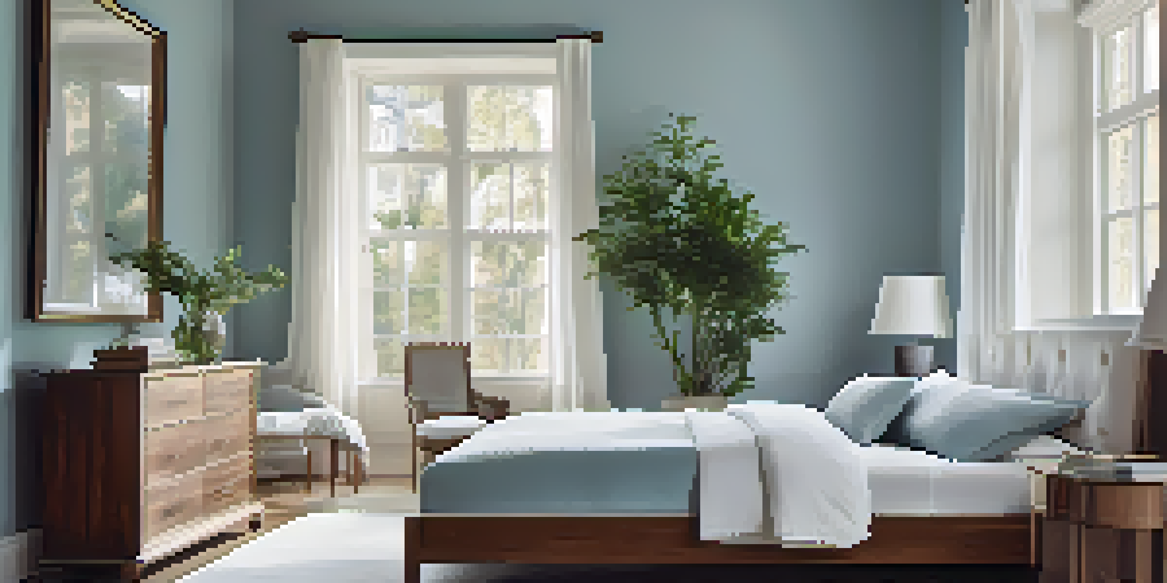
For example, consider how blue often symbolizes trust and serenity, making it a popular choice for bedrooms. Meanwhile, warmer colors like red and orange can stimulate energy and excitement, perfect for entertaining spaces. By understanding these associations, homeowners can curate an environment that reflects their lifestyle and aspirations.
Related Resource
When selecting a color palette, it's crucial to think about the message you want your home to convey. A well-thought-out color scheme can transform a space, making it feel more luxurious and thoughtfully designed.
The Role of Neutrals in Luxury Homes
Neutrals are often the backbone of luxury design, providing a sophisticated canvas that allows other elements to shine. Shades like cream, gray, and taupe can create a timeless elegance that never goes out of style. They also offer versatility, seamlessly blending with various accent colors and furnishings.
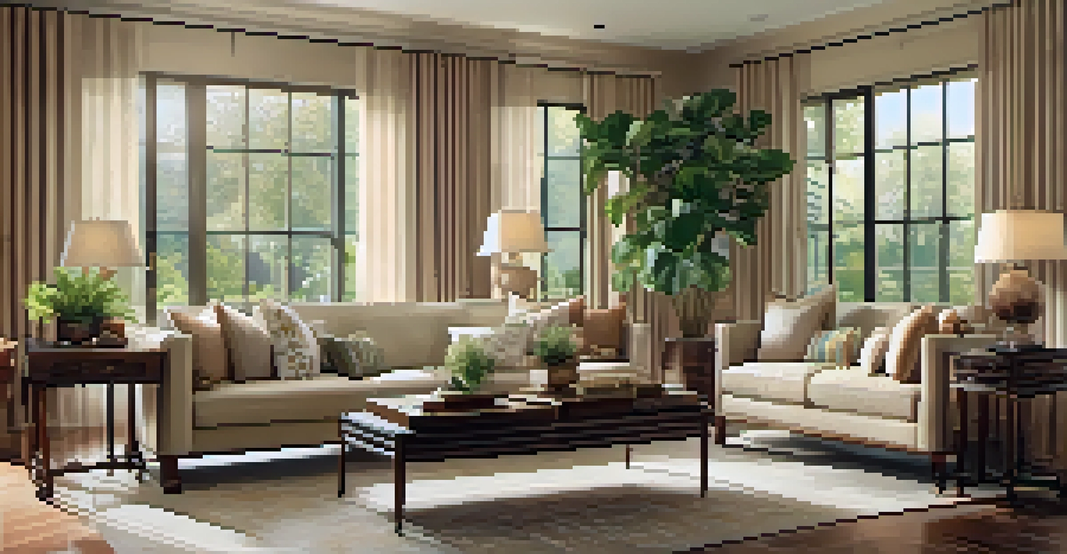
Imagine walking into a living room adorned with soft beige walls and rich mahogany furniture. The neutral backdrop enhances the warmth of the wood, creating a cozy yet refined setting. This balance is a hallmark of luxury design, where every detail matters.
Color Psychology Shapes Atmosphere
Understanding how colors evoke emotions can help homeowners create inviting and luxurious spaces.
Additionally, neutrals can help amplify natural light, making spaces feel more open and airy. This is especially beneficial in luxury homes, where spaciousness is often a key feature.
Bold Colors: Making a Statement
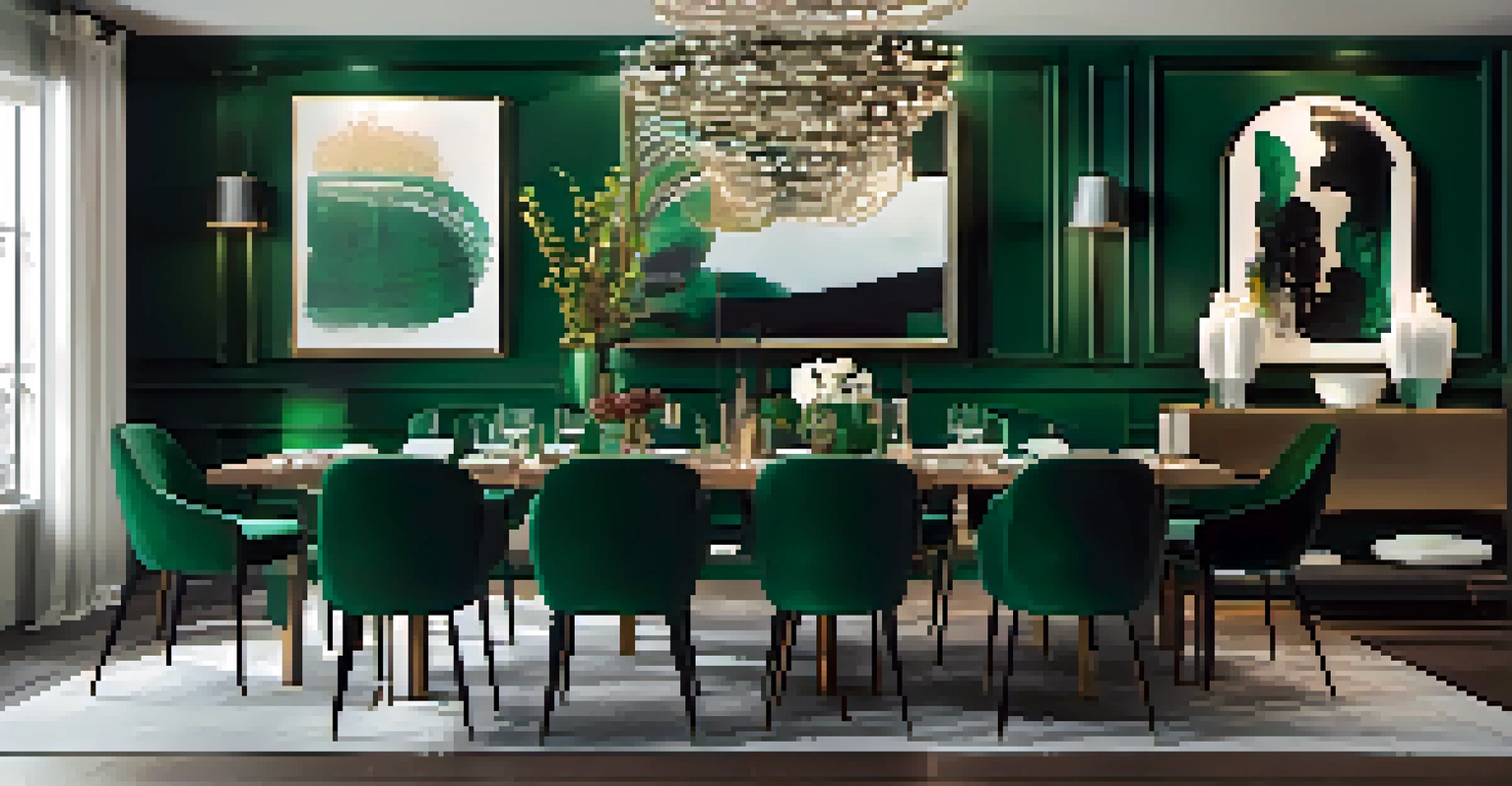
While neutrals provide a solid foundation, bold colors can introduce personality and flair to luxury homes. Think about using deep greens, royal blues, or vibrant reds to create focal points in a room. These colors can make a powerful statement when used wisely and can elevate the overall aesthetic.
Colors are the smiles of nature.
For instance, a striking emerald green accent wall can serve as a stunning backdrop for artwork or decorative features. It draws the eye and adds a touch of drama, which can be particularly captivating in dining or entertainment areas.
Related Resource
However, it's essential to balance bold colors with softer elements to prevent overwhelming the space. Using them as accents rather than the main color can strike the perfect balance between luxury and comfort.
Creating Harmony with Color Combinations
A successful color palette harmonizes various shades and tones, creating a cohesive flow throughout the home. To achieve this, consider using a color wheel to identify complementary colors that enhance one another. This method can yield stunning results, lending a sense of unity to your design.
For example, pairing soft pastels with rich jewel tones can create an inviting yet sophisticated atmosphere. Imagine a pale pink living room complemented by deep navy accents—this combination offers both warmth and elegance, making it a popular choice in luxury designs.
Neutrals Provide Timeless Elegance
Neutrals serve as a sophisticated foundation, allowing other design elements to shine and enhancing natural light.
Moreover, incorporating different textures can heighten the visual interest of your color scheme. Combining matte and glossy finishes, or smooth and rough textures, can amplify the luxurious feel of your spaces.
The Influence of Natural Light on Color Perception
Natural light plays a pivotal role in how colors are perceived within a space. Different times of day can significantly alter the appearance of paint or furnishings, making it vital to test colors in various lighting conditions before committing. This is especially true in luxury homes with large windows that invite abundant sunlight.
For instance, a warm beige may appear cozy and inviting in the morning sun but could take on a cooler tone in the evening. This shift can impact the overall mood of a room, so observing colors throughout the day can help ensure they align with your desired atmosphere.
Related Resource
Additionally, incorporating large mirrors or reflective surfaces can enhance natural light, further enriching your color choices and making your luxury space feel even more expansive.
Emotional Effects of Color in Luxury Spaces
Different colors evoke distinct emotions, and understanding these effects can guide your choices for luxury homes. For example, soft blues and greens can promote relaxation, making them ideal for bedrooms or spas. In contrast, vibrant yellows can stimulate creativity and energy, perfect for home offices or playrooms.
Consider how you want to feel in each space. A dining room might benefit from warm, inviting tones that encourage conversation and connection, while a personal library could feature calming hues that promote focus and contemplation.
Bold Colors Add Personality
Incorporating bold colors as accents can introduce flair and make powerful statements in luxury home design.
Using color to enhance emotional well-being is not just a design choice; it's a lifestyle choice. By consciously selecting colors that uplift or soothe, homeowners can create environments that enrich their daily lives.
Trends in Color for Luxury Homes
Staying updated on color trends can help homeowners make informed decisions when selecting their palettes. In recent years, earthy tones and muted shades have gained popularity, reflecting a desire for calm and connection to nature. Colors like terracotta, sage green, and soft taupe create a grounded, welcoming ambiance.
Furthermore, the resurgence of retro colors, like burnt orange and mustard yellow, can add a playful twist to luxury design. These trends can be incorporated through accent pieces or smaller decor items, allowing for a touch of nostalgia without overwhelming the overall aesthetic.
Ultimately, while trends can inform choices, personal preferences should remain a priority. A timeless luxury home is one that resonates with its owners and reflects their unique style.
Conclusion: Crafting Your Perfect Luxury Palette
Choosing the right color palette for a luxury home is both an art and a science. By understanding color psychology, homeowners can create spaces that not only look stunning but also feel harmonious and inviting. From the calming effects of neutrals to the bold statements made by vibrant hues, every choice contributes to the overall atmosphere.
As you embark on this journey, remember to consider factors like natural light and emotional effects of colors. Testing combinations and staying informed about trends can further refine your selections, ensuring that your home reflects your personal style and values.
In the end, your luxury home should tell a story—a narrative woven through colors that evoke emotions, create memories, and invite warmth. Embrace this opportunity to express yourself through your color choices and craft a beautiful, luxurious haven.